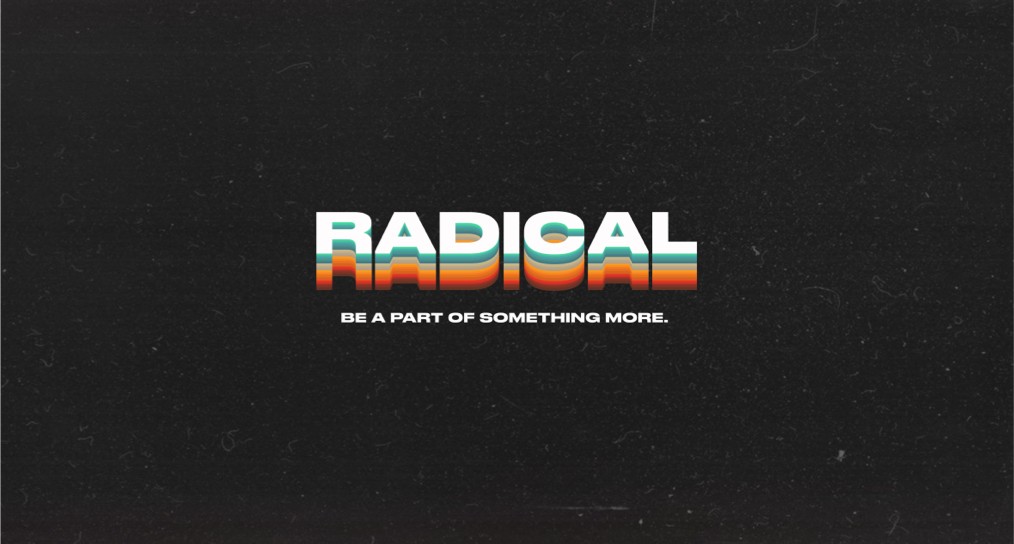
Radical was a message series at RockFish Church in the fall of 2019. Nathan Stanley, the church’s project lead and director of leadership development, brought me in to design the digital assets and printed promotion.
The series focused on living a radical life through spiritual conviction and selfless action. Nathan and I started with discovery and brainstorming sessions, working through the messaging, look, and feel of the campaign.
The Process
Finding the direction
The name Radical brought the 80s to mind for Nathan and me. We used that association as a starting point and worked through what an 80s direction could look like for the series.
Retro stripes, worn textures, and the color palette gave us a way to suggest the era across the campaign.

Choosing the palette
I wanted an 80s reference without leaning on neon and chrome or making it feel like Tron.
I chose a rugged, muted palette and carried it through the graphics and printed materials. It gave us the retro feel we wanted while keeping the direction distinct from that neon look.

Digital and printed materials
The direction carried into social content and the sound design for the promotional videos. I wanted the video, print, and apparel to feel like they belonged to the same campaign.
The printed pieces included invitation cards that members could hand to friends and family, along with t-shirts for the series.


Tracking the campaign
We put QR codes on the printed pieces, used Bitly to track clicks, and used Google Analytics to track conversions. That setup gave us a way to connect the printed promotion to activity on the website.
The campaign launched on schedule and inside its budget.
I do not have campaign totals to share here. One thing I did notice afterward was people continuing to wear the t-shirts long after the series had ended. I liked seeing the design stay in use.
Working with Nathan
Radical was one of the earlier projects that made me appreciate working through a direction with someone else. The conversations with Nathan helped shape the campaign, and I enjoyed that part of the process.
I still do much of the design work on my own. I look for those shaping conversations early in a project because they help me understand what the work needs to do.


RECOMMENDED READING

