Church Website Hero started as a conversation with a close friend. Shawn Morgan ran the business idea by me and asked if I’d be interested in doing the logo.
He wanted to build websites for churches so their staff could spend less time managing web design and more time on ministry. The business was still taking shape while we worked on the identity.
The Process
Audience and positioning
Before I drew anything, Shawn and I defined the scope, the audience, and the positioning. I needed to understand what Church Website Hero was offering and who it was for.
Church staff needed a website service that would take work off their plates. I wanted the identity to feel approachable and capable, in keeping with that service.

Developing the mark
I started with familiar website symbols: a browser loading icon and an arrow. Those gave me a connection to the work the company would be doing.
I combined them with a hero symbol, tying the mark back to the company’s name. The loading icon suggested a website in progress, and the arrow added a sense of movement.
Shawn and I worked through drafts and review rounds until we had a mark he was happy with. I then tested how it would work at different sizes.

Testing the responsive logo
The full logo pairs the icon with the company name. Smaller applications need a simpler version, so I developed variations for social profiles and app icons and checked that the mark remained recognizable.
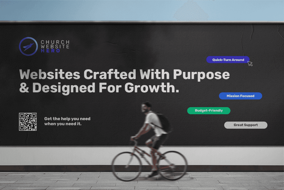
I also built a small identity system so Shawn could see the logo on a business card, in an advertising concept, and as an app icon. The style guide documented how to use it.

The finished identity
I judged the design against three things: whether it felt distinct, whether the shape was easy to remember, and whether it worked across different sizes and applications. The versions below show how I tested that last part.
The final package included the responsive logo, a style guide, app icons, a business card, and an advertising concept.
Shawn seemed happy with it. I still remember seeing the mark on the live website for the first time.


Presenting the identity
This project changed how I present identity work.
I used to show logo concepts on their own and hope the client could picture the rest. Now I bring more of the identity into the presentation: the typography, imagery, language, and examples of how it will be used.

RECOMMENDED READING